A logo is important. If you ever thought otherwise, just ask Cracker Barrel how their country-old-man-removing rebrand went, or how much consternation Major League Baseball fans have every time their team adopts a new City Connect uniform scheme.
So, it is only natural that Shippensburg University’s Athletics Department’s release of their new logo would invite a scrutinizing eye to determine if it makes the grade.
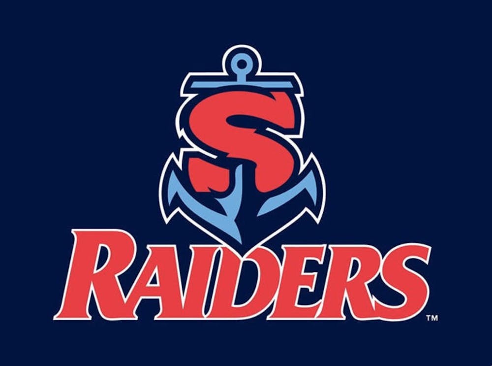
On paper, it is a positive addition to the Ship brand, though it falls short of being a perfect fit.
To judge it properly, it helps to first identify why it was needed. Traditionally, a university’s academic and sports branding are separate. That had not been the case at Ship, so it is exciting to think about this new logo as the start of a new legacy.
The logo itself is a bit odd, though. It is hard not to think of it as a missed opportunity to not have used a whole ship, as opposed to just an anchor. After all, we are Shippensburg, and we have never been shy to play into the name before. Not to mention the anchor could be parodied against us. It could symbolize being stuck in place or being unable to move, which is generally the opposite of what you should do in sports.
The color scheme seems off as well, and this is popular topic to debate in sports. When the Philadelphia Phillies debuted their first City Connect jersey last year, many fans were irate over the decision to use navy blue and yellow over the team’s usual red and blue.
Ship also waded into this issue as they made a similar move. The pastel blue feels out of place when navy blue is default in everything else. And for the typography critics, the font of the aforementioned “S” does not mesh well with the other typefaces used by the university.
But all things in art are subjective in their interpretations. The new logo pops over what some may consider an anachronistic former logo. The new logo may give a little whiplash because it is new, but it is a good kind of new. Simple logos often look better, so the red “S” and blue anchor fit the intended aesthetic.
And, while an anchor can stop a ship, it can be argued that it symbolizes strength. Teams have players who are anchors, who hold it all down and go out there and game. Alternatively, it is entirely possible that Ship dropping the anchor in the end zone could be a popular touchdown celebration.
The lens in which to look at the new logo is this: uniformity is bland, and the new logo is a step in the right direction in bringing back creativity in a world where artificial intelligence makes that creativity harder to find.


The Slate welcomes thoughtful discussion on all of our stories, but please keep comments civil and on-topic. Read our full guidelines here.